Responsive Mobile App RedesignSpot On
🔨 Project Overview
Problem
Spot On is an app designed by Planned Parenthood to help track an individuals menstrual and ovulation cycles, giving insights into hormone health and overall well-being. Their current platform is inconsistent, difficult to use, and out-dated.
Solution
Redesign a responsive platform that provides easier tracking and messaging capabilities. Create an app that is both functional and communicates the organization’s goals and mission to its audience in a clear and visually pleasing way.
Timeframe
4 weeks
Contribution
UX + UI Design, Visual redesign, Feature flow, Branding redesign, Research, Prototyping + Testing
Team
Individual project mentored by Anna Brenner

🔎 Background
Understand the platform’s current state, considering it’s users needs and pain points
Before starting the preliminary sketches for Spot On it was important to consider how the app currently works. Specifically, determining its current functionalities, identifying any areas for improvement, and translating the the organization's needs into a redesign.
As a non-profit providing affordable reproductive healthcare, it was crucial to deliver accessible services through the app. However, ensuring the tracking capabilities are not overshadowed by the healthcare services is equally as important. These features currently seem like an afterthought, resulting in a slow and glitchy user experience that limits the app's effectiveness.

📣 User Research
Analyze customer feedback to better understand their needs
While hands-on research is my preferred method for gathering insights, finding individuals who had prior experience with Spot On proved to be quite challenging. As a result I relied on user reviews from popular app providers such as Apple and Google. While the app has maintained a following since its creation, many users mention waning interest due to inconsistent features and lack of customizability.
“I really wanted to like this app. The user interface is garbage. You can barely even edit. I'd rather go back to old fashioned paper and pencil than use this.”
- Customer review through Google

👫 Personas
Explore user profiles that connect most with the brand
Personas were made to understand the unique qualities, preferences, and behaviors of the people most likely to connect with the brand and its services. By using these illustrations, the brand can understand its users better and customize its approach, resulting in a more enjoyable experience.

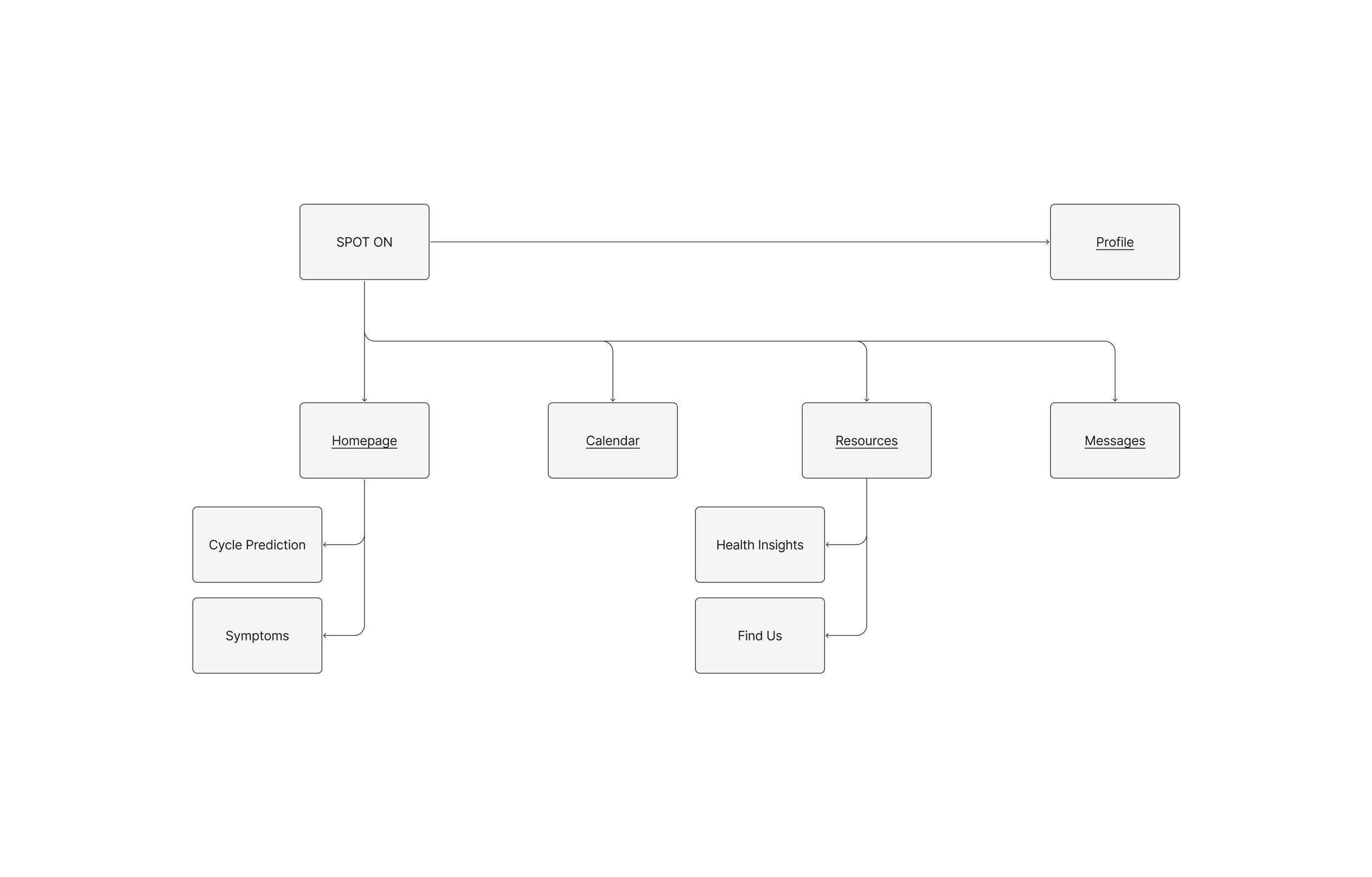
🧭 Information Architecture
Site map and product requirements
Preliminary research revealed challenges in Spot On’s lack of cohesion and functionality, emphasizing the need for consistency and accessibility within the app’s redesign. By mapping out resources and offering customizable features it is easier for users to understand their hormone cycles and get the support they need for their well-being.
🌀 User Flow
Determine how the user moves through the website
Once the site map and product requirements were defined a user flow was created to reflect the main-use cases. Based on user research it was important to provide a cohesive site with clear and accessible information.
Relevant screens were designed for both new and existing user flows including; onboarding, landing, calendar, resource, and message pages. This would inform what would be prioritized for the website’s wireframes and final design.

🧱 Wireframes
Ideating and early stages of design
Wire-framing focused on cohesive and engaging screens with customizable features. From the information gained during research it became clear that users want consistent features that are attractive and easy to use. Each frame was designed with a detailed approach that brought a fresh perspective to conventional health services.

📈 User Testing
Iterating and improving designs
A single-round usability study was conducted to evaluate the functionality and user experience of the low-fidelity wireframes. Participants were asked to complete a series of tasks, with a follow-up interview given following the prototyping. The study focused on answering the following questions:
Are users able to successfully log their period and symptoms?
What level of ease is there in navigating the app?
How does the information and content make individuals feel?
Did individuals encounter any difficulties when executing their tasks?
The following insights were gained from the study results and used to make improvements to the wireframes:
Each user was able to successfully log their period and symptoms
There was some confusion distinguishing between the main page log and the calendar log system
Participants expressed interest in a more comprehensive messaging system
Narrow padding and navigation position made click-ability difficult for some users

🥀 Visual Design
Brand identity and visual language
When comparing other apps a pattern for more playful, unique designs appeared, inspiring Spot On’s monochromatic theme. Utilizing fun typography and eye-catching color ensures that it stands out from its competitors and captures users attention.
Typography
After exploring different font combinations Suisse Int’l was chosen in both mono and its standard font form. As a sans serif it provides a degree of authority while still maintaining a light and playful tone.
Color
During research I noticed many apps chose colors which were notoriously gendered. Specifically, shades of purple and pink as primary and secondary palettes. It became my challenge to offer a more accessible color palette which steered away from stereotypically feminine tones.

🍾 Onboarding and Login
A simple and clean approach
The primary brand color is introduced during the initial log in flow. This sets the precedent for the rest of the app and is easily recognizable to the theme of Spot On’s intentions. The onboarding and log in screens are minimal and clean with plenty of white space. By adopting a minimalist approach information can be gleaned easily and without fatiguing users. The main goal always came back to designing a personalized account that helps users understand their body and hormones.

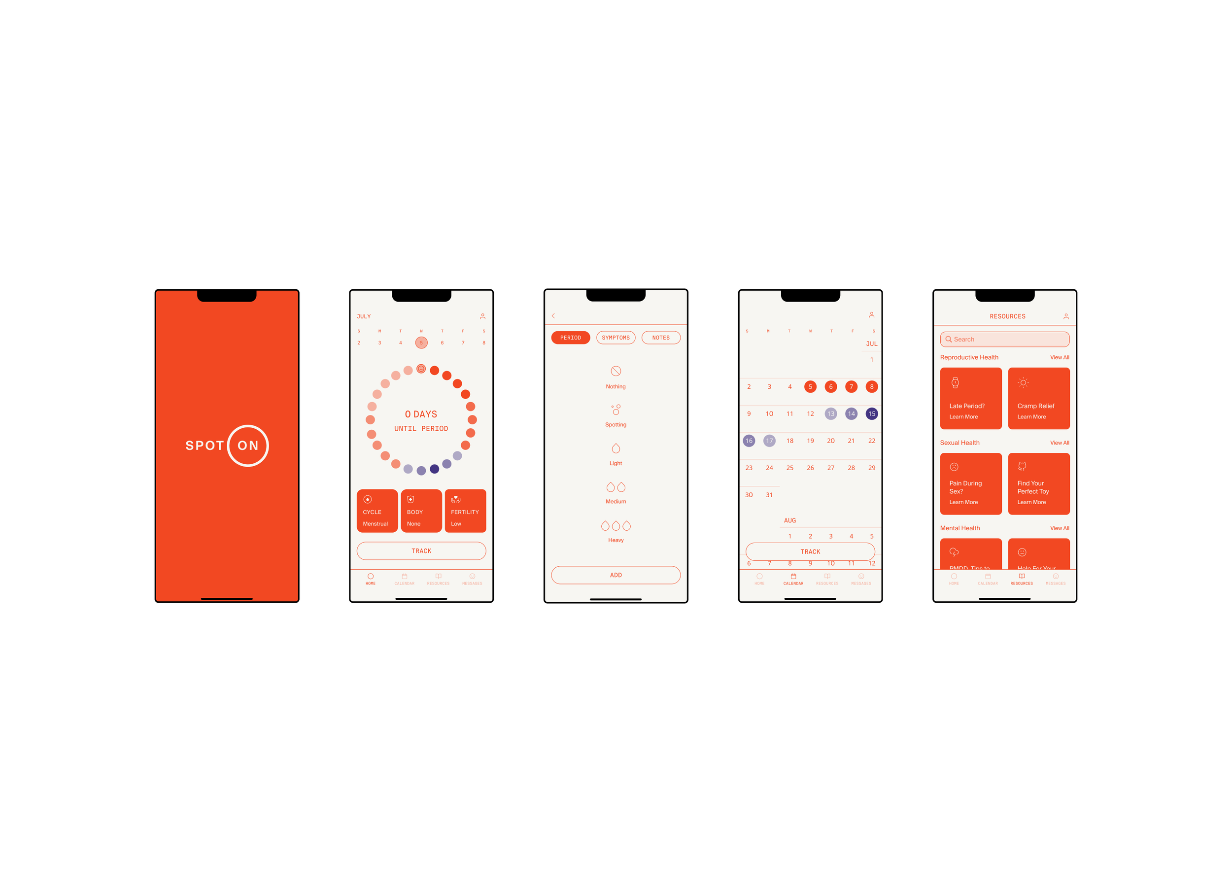
🏠 Homepage
Personalized illustration of cycle and symptoms
It was important while designing the homepage to make features fun and interactive. Utilizing tone, white space, and color a personalized model of the users cycle was created. Both the cycle and symptoms can be changed, edited, or removed to create more tailored predictions for the users cycle. From the homepage users can begin to navigate the app, exploring resources or simply logging their personal insights.

⌨️ Cycle tracking
Log and edit symptoms and cycle
Poor tracking and cycle predictions were two issues encountered during the research phase of the app. When designing the tracking features it was important to make them easy-to-use and functional. Users can track their menstrual cycle, their physical and mental symptoms, as well as write notes about their experience on any given day. Equally important was adding elements of playfulness in the way of iconography. Illustrations were added to help users connect with their symptoms and emotions to personalize cycle predictions with more accuracy.
📆 Calendar
Expanded way to view and edit cycle information
Designed to be intuitive and easy-to-use the app’s calendar page presents a different view of a users cycle. The visual layout is straightforward offering familiar features to other calendars such as scrollable dates, and editing tools. However, period predictions are uniquely color coated to indicate where and when changes might occur within a users hormone cycle. Users are also able to edit and add to their calendars, be it symptoms, pregnancy, or a revision to their overall cycle.

☂️ Resources
A chance for users to gain personalized health insights and find a PP location
Resources play an important part in empowering users to look deeper at their health and wellbeing. While this was a preexisting feature of the app it lacked information and was confusing to use. Users are now able to search and scroll a wide variety of personalized articles and tips. What’s more, the location finder is now a interactive feature within the app. Before users were redirected to Planned Parenthood’s website making for an arduous process of steps.

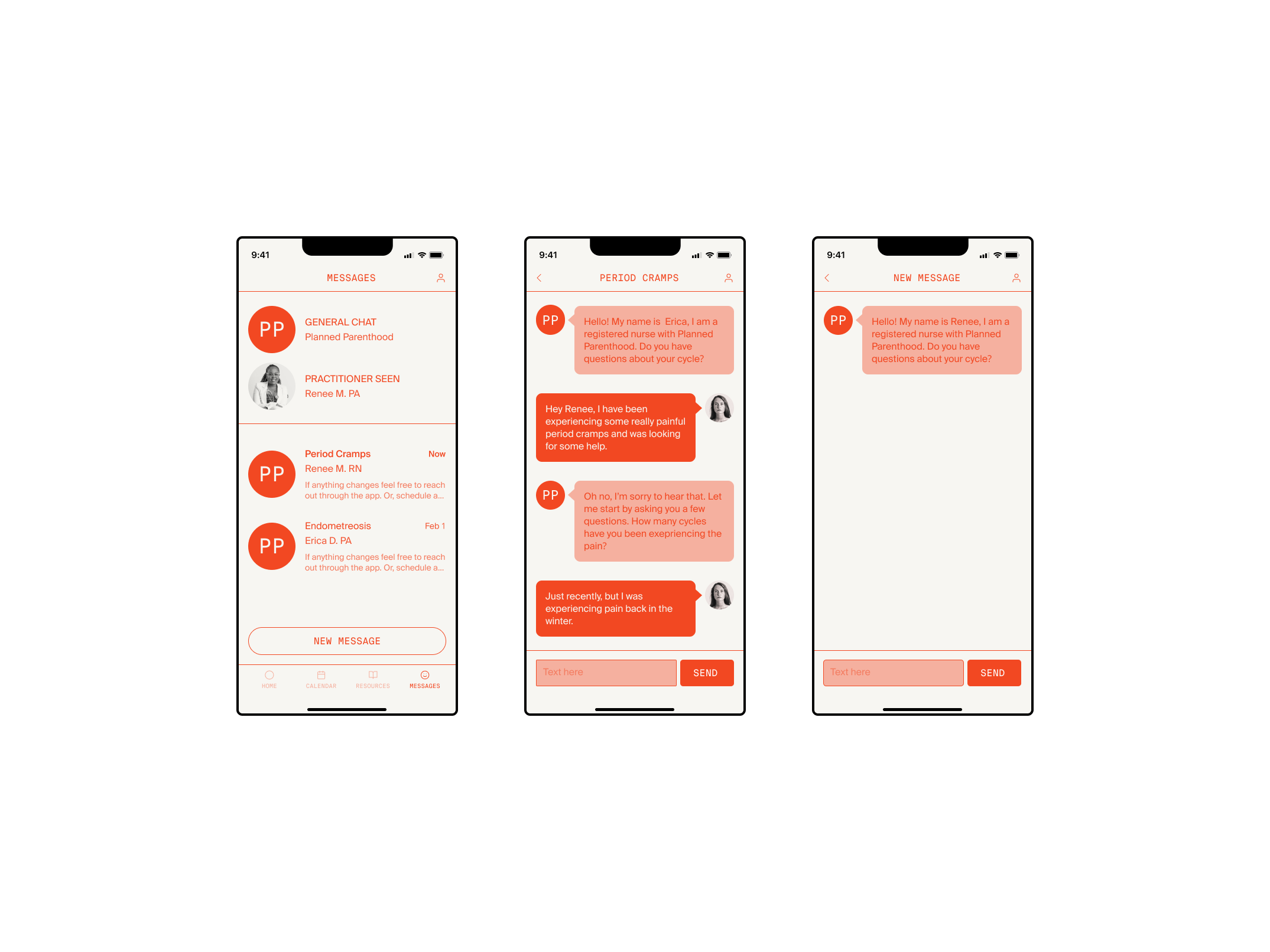
💬 Messages
Interactive tool for users to message with health practitioners
This added feature allows users to communicate with health professionals and receive one-on-one support for their health needs. The main message hub needed to be expansive while also being easy to skim at a glance; users can view previous practitioners, access old messages, and start new ones. Differences in visual affordance were added to create messages that were scannable and intuitive to read.
👤 Profile
Personal information and settings
In the final tab of the main navigation users will find practical personal information and setting options. With a simple list view, users can personalize both their cycle and profile information, set reminders for their cycle, add photos, and request technical support.

Explore Spot On through prototyping
Reflection
Takeaways
With its diverse features and personalized tracking system Spot On motivated me to take a new approach on the menstrual app. Requiring an organized approach my goal was to revise the app with a compelling visual language and design a more effective product.
Future improvements
I’d love to explore how this app can continue to grow and serve its user base. Here are a few areas that I think could be further improved upon and actions that I would take to create an even more effective product.
Further develop the message hub for increased appointment scheduling and management
Add more symptom choices to the log to further personalize cycle updates
Conduct another round of user testing to identify pain points and user needs