Responsive Web and Mobile DesignSoma Health

🔨 Project Overview
Data shows that just 1 out of every 8 Americans achieve ideal metabolic health, pointing to increased public health concerns in the United States. Rising costs and over-saturated health institutions make it difficult for most individuals to access the healthcare they need.
Problem
Solution
Build a website and brand that encourages a holistic approach to preventative care by offering products that support a personalized wellness routine.
Timeframe
8 weeks
Contribution
UX + UI Design, Branding, Research, Responsive Design, Prototyping + Testing, Visual Design, Product Design
Team
Individual project with mentorship by Anna Brenner

📣 User Interviews
Talk with users to gain a greater understanding of their needs
Six participants were interviewed on the topic of supplement use and their effectiveness on their well-being and health. Results showed that all participants have used supplements and felt a benefit in their mental and physical health.
However, feedback also showed that users feel overwhelmed with the amount of information surrounding supplemental health products, making it difficult to make decisions and create a routine.

🔎 Competitive Analysis
Research major competitors in order to gather insight on current products and services
In order to understand the current landscape of supplemental wellness products, three websites were thoroughly analyzed to identify the strengths and weaknesses of direct and indirect competitors within the field. The objective was to highlight areas of improvement and find opportunities for elevating and simplifying the user experience.

🧭 Information Architecture
Site map and product requirements
Landscape analysis and user research revealed that existing websites and online marketplaces are overwhelming and hard to navigate. Soma was designed with the main goal of making purchasing a supplement easy and stress-free.
Objectives for the site were broken down into “must-have”, “would-like to have”, and “later iteration”. Keeping these goals in mind the product requirements became focused on ease and accessibility, with later iterations building up to more product features and offerings.

🌀 User Flow
Determine how the user moves through the website
Once the site map and product requirements were defined, a user flow was created to reflect the main-use cases. Based on user research, it was important to provide a cohesive site with clear and accessible information.
Screens were designed relevant to the flows of both new and existing users including a landing page, shop page, quiz, and about page. This would inform what would be prioritized for the website’s task flow, wireframes and final design.

🗒️ Task Flow
Focus on a task and determine the clearest path of accomplishment
In today's fast-paced world, consumers value convenience and efficiency above all else. When it comes to purchasing supplement products, users seek a reliable and easy online experience that allows them to find and purchase their desired products at their own convenience. To achieve this goal, a carefully crafted task flow was developed to guide the navigational flow of the website, ensuring a seamless and intuitive user experience.

🧱 Wireframes
Ideating and early stages of design
During the development stage I experimented with various layouts for the main screens of the website, aiming to strike the perfect balance between familiarity and elegance. I wanted Soma to tap into familiar wellness motifs; connecting with an audience's existing associations to help establish a sense of comfort and trust. People gravitate towards brands that they can relate to, my goal was to create a platform that resonated with users on a personal level.
However, I also recognized that visual appeal plays a significant role in capturing users' loyalty. User research revealed that participants were drawn to brands that offered a mix of relatability and visual sophistication. My goal was to strike the perfect balance between elegant visual design and relevant, valuable information.

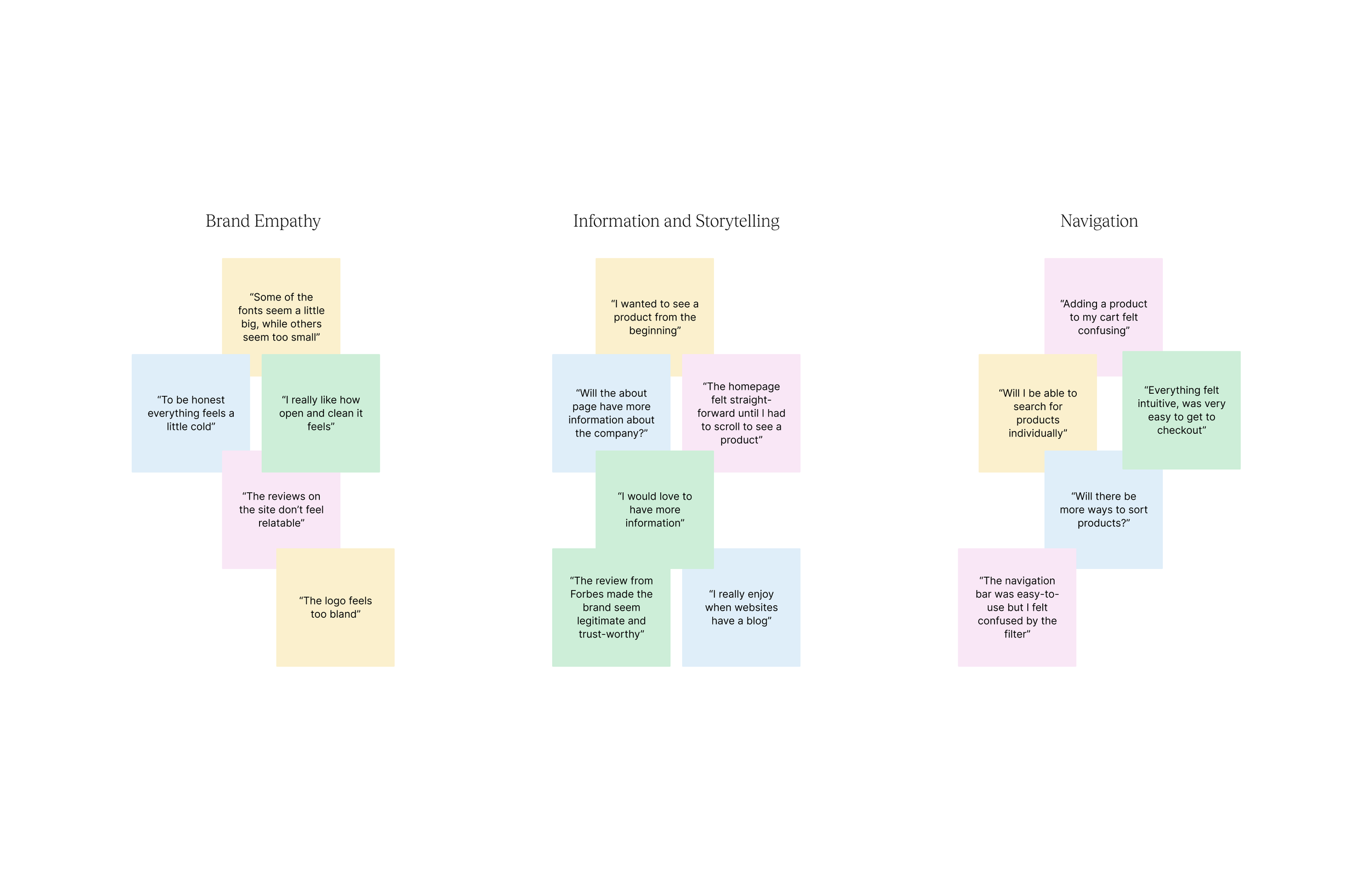
📈 User Testing
Iterating and improving designs
One round of an unmoderated usability study was completed to test the functionality of the low-fidelity wireframes. Participants were asked to complete a series of tasks using the prototype; follow-up interviews were conducted after each task was completed. The study focused on answering the following questions:
How easy was it for individuals to navigate the website?
How easy was it for individuals to add a product to their cart?
How did the information on the site make them feel?
Did individuals encounter any difficulties when executing their tasks?
The following insights were gained from the study results and used to make improvements to the wireframes:
Users wanted more ways to sort and filter products
Users want to see products appear quicker on the homepage
The lack of story-telling made users feel less connected to the brand
Users felt that the website felt cold and appealed for more content in the homepage
🥀 Visual Design
Brand identity and visual language
Careful consideration was taken with the visual design of Soma; recognizing the significant impact it can have on users' perceptions and loyalty towards a brand. Users often feel a stronger connection to brands that exhibit clean, cohesive design elements throughout their products and services.
With this understanding, Soma was designed with a visual identity that not only reflected the brand's values but also resonated with users on a deeper level. Every aspect of the design was meticulously crafted to evoke a sense of trust, reliability, and sophistication. This approach allowed users to focus on the core message and purpose of the brand, fostering a seamless user experience.
Typography
After exploring different combinations the final font pairing was an elegant serif and soft sans. The serif gave an elevated authority to the heading while the sans added playful hierarchy to the body copy.
Color
Decisions on color were made with simplicity and elegance in mind. The primary color was White Smoke, with Eerie Black selected as the secondary color, and Charcoal Blue as the tertiary color. In choosing such a classic palette it allowed for the playfulness of the typography and product images to stand-out.

🏠 Homepage
Finalized designs for web
The redesigned homepage offers a warmer, more welcoming UI while also informing visitors about the mission and products of Soma.
Bold headlines are followed by short descriptions to communicate important parts of the brand’s identity without overwhelming the user. Included in the design are visual aids and quantify-able impact measures to help instill trust and connection with visitors.

👛 Collections page
Collective view of products offered
As with the homepage, whitespace is utilized to create an open and clean design. The collection page is intentionally minimal and straightforward, allowing the supplements to speak for themselves. To further support user experience, products can be sorted and filtered based on broad, or specific preferences.

💊 Product page
Familiar UI with clear calls to action
The product details page maintains familiar UI elements found in many online wellness brands while showcasing the visual branding and style of Soma. Along with providing users with detailed information about the product, the page allows for easy checkout and purchasing. This page also offers other supplement recommendations based on the user’s history and encourages the user to continue browsing the shop.

🛒 Mini-cart
Clear calls to action for fast checkout
The mini-cart was designed with ease and efficiency in mind. Here the user can view, edit, and add to their cart. The design was modeled after similar mini-carts to allow for a familiar user experience. By playing off this understanding, users can more easily make choices around their purchase - leading to faster checkout.

✍️ Prototyping
Experience how users navigate the site and adjust for improved usability
During prototyping users were asked to move through the task flow of purchasing a product. Starting from the homepage the flow was completed when a product was successfully added to their cart. Users were also asked to explore the site and discuss how they felt, and if they would return to the site.
The following insights were gained from these results:
Users took an average of 4s to add a product to their cart
Users focused their exploration to the homepage and collections page
Users encountered difficulty when navigating the collections page
All expressed that they would return to the site
“The website feels special - like I was about to purchase something made just for me. Would I return again? Yes!”
- Stanley, 28, test participant
📌 Iteration
Modifications which enhance the user experience
Prototyping highlighted both the satisfaction, and confusion, experienced by the user during the purchase flow. The users found it frustrating that they could only navigate within the “Bestsellers” collection page.
An additional level was created within the website collections to address this confusion. When navigating the website, users have the ability to start from a “Shop All” page and filter down according to their preferences.

📞 Mobile adaptation
Responsive design across multiple devices
An important element to this design was making sure that Soma was responsive to multiple devices. Recent studies show that mobile users account for over 62% of all website traffic. An effective website needs to be able to adapt across screens and devices.
The challenge for the mobile design was displaying all the same information on a much smaller screen size. With users not being able to hover on mobile this also meant altering certain interactions (i.e. navigation cues). These subtle but important adaptations create a unified and fully responsive experience.

Reflection
Takeaways
This project fueled my passion for contributing to digital spaces with fun, elegant designs. It was rewarding to consider how a design might empower individuals to take pleasure in their wellbeing. It also taught me the importance of frequent user testing and iterative design. As designers, the impact of user feedback is crucial for establishing functional and timeless designs.
Future improvements
I’d love to explore how this website could continue to grow in serving Soma and its users. Here are a few areas that I think could be further improved upon and actions that I would take to create an even more effective product.
Expanding the Body Diagnostic tab to include a comprehensive quiz for more personalized product recommendations
Adding more opportunities for filtering and sorting of products
Conducting another round of user testing to identify pain points and user needs.